Intro
TanStack Table is an incredibly powerful library for creating tables in React (or your framework of choice). It’s a self-described “headless” library, meaning it provides the data structures, state management, and processing functionality for working with tables of arbitrary complexity, but it doesn’t provide any styling or user interface. When choosing a React library for UI elements, I typically prefer headless libraries; they abstract away many of the challenging aspects of UI development and let me focus on customizing the styling.
I use TanStack Table for implementing tables in applications whenever possible because of its deep flexibility. In this post, we’re going to cover one element of that flexibility that you’re very likely to utilize as soon as your table needs to do more than display static data. TODO - reword?
Project Setup
If you want to follow along, then spin up a basic React project using your framework of choice (I’ll be using Vite and TypeScript) and install the TanStack Table React package (I’m using version 8.13.2 at time of writing):
npm i @tanstack/react-table@8.13.2
We’ll start by defining a very basic dataset to represent an album collection.
type TAlbum = {
  id: string;
  artist: string;
  name: string;
  releaseYear: number;
  genres: string[];
};

const data: TAlbum[] = [
  {
    id: "af3f568f-c772-402f-8532-9a8759e937d3",
    artist: "Metallica",
    name: "Ride the Lightning",
    releaseYear: 1984,
    genres: ["Metal", "Thrash"],
  },
  {
    id: "3a41723c-9a51-4ab9-8148-e208e5cd1695",
    artist: "Avenged Sevenfold",
    name: "Life is but a Dream",
    releaseYear: 2023,
    genres: ["Metal", "Hard Rock"],
  },
];
Next, let’s create a basic table using TanStack table. We’ll break this up into two parts; first, we’ll define the columns and create the table instance.
const columns: ColumnDef<TAlbum>[] = [
  {
    header: "Album Name",
    accessorKey: "name",
  },
  {
    header: "Artist",
    accessorKey: "artist",
  },
  {
    header: "Release Year",
    accessorKey: "releaseYear",
  },
];

const table = useReactTable<TAlbum>({
  columns,
  data,
  getCoreRowModel: getCoreRowModel<TAlbum>(),
});
Finally, we’ll render a basic table. I split this into two components, a header and a body, for clarity.
const TableHeader = ({ table }: { table: Table<TAlbum> }) => {
return (
<thead>
{table.getHeaderGroups().map((headerGroup) => (
<tr key={headerGroup.id}>
{headerGroup.headers.map((header) => (
<th key={header.id}>
{header.isPlaceholder
? null
: flexRender(
header.column.columnDef.header,
header.getContext()
)}
</th>
))}
</tr>
))}
</thead>
);
};
const TableBody = ({ table }: { table: Table<TAlbum> }) => {
return (
<tbody>
{table.getRowModel().rows.map((row) => (
<tr key={row.id}>
{row.getVisibleCells().map((cell) => (
<td key={cell.id}>
{flexRender(cell.column.columnDef.cell, cell.getContext())}
</td>
))}
</tr>
))}
</tbody>
);
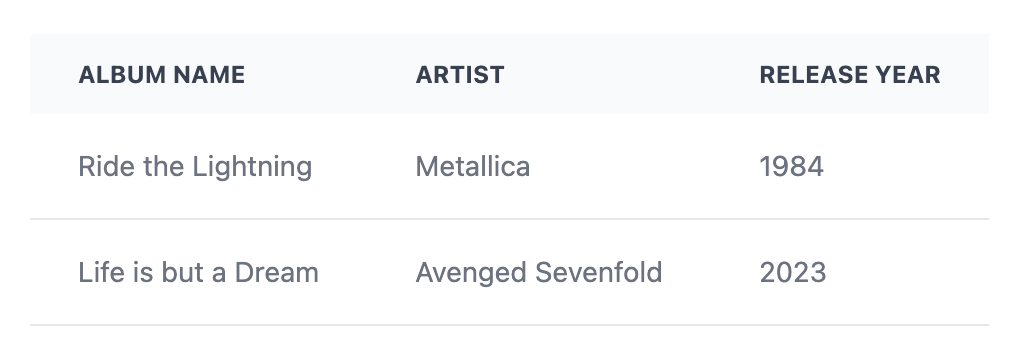
};At this point, we have a basic table that looks as follows:
Display Columns
TanStack Table has three different column types; accessor columns, display columns, and grouping columns. So far, we’ve only used accessor columns. This shouldn’t be a suprise given that each one of our column definitions has an accessorKey property. Accessor columns are what you’ll use the majority of the time, and a column is an accessor column if it includes either the accessorKey or accessorFn properties. You can apply various operations to them, such as sorting, grouping, and filtering.
Display columns, as the name implies, are used to display any content you’d like. For example, you might want to display a button that triggers an action such as deleting the row data. Let’s add a display column to our table to see how they work. Add the following object to the column definition array to create an “Action” column with a button that simulates deleting a record from the table (to keep the example simple, we’ll just display an alert instead of actually deleting the data).
const columns: ColumnDef<TAlbum>[] = [
  // Existing columns omitted
  {
    header: "Actions",
    cell: () => {
      return <button onClick={() => alert("Album deleted")}>Delete</button>;
    },
  },
];
The new column definition is pretty simple; we have a header (nothing new there), but instead of setting the accessorKey property, we use the cell property and assign to it a function that renders an element, which in this case is a basic Delete button.
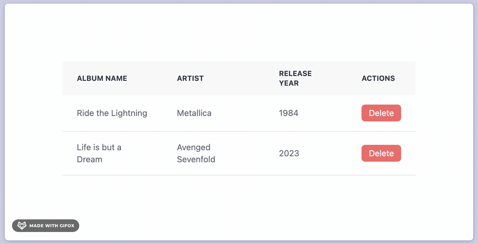
This isn’t very useful yet; if we were actually deleting the album, we’d need access to the row’s id property and pass that along to a function that will delete the entity with that ID. Fortunately, the callback we assign to cell accepts an argument called props, which has all kinds of useful information about the row. Let’s modify the column definition above to extract the row ID and include it in the alert message.
const columns: ColumnDef<TAlbum>[] = [
{
header: "Actions",
cell: (props) => {
return (
<button onClick={() => alert(`Album ${props.row.original.id} deleted`)}>
Delete
</button>
);
},
},
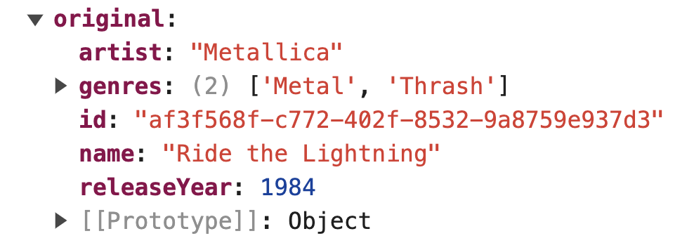
];The props parameter has a property called row, and we’re accessing the original property from the row object. This property is just the raw data entity used to populate the table row. Here’s what it looks like when logged to the console:
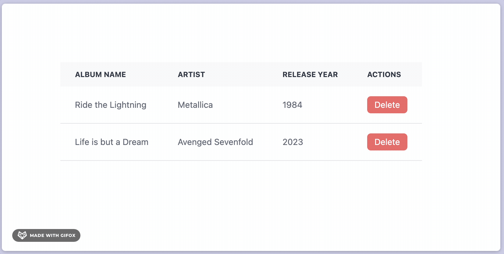
We’re only using the ID, but we can obviously use any property from the object. Here’s what our example looks like after adding the album ID to the alert message.
So what exactly is the props parameter that we’re using? If you’re using TypeScript and you hover over it in your editor, you’ll see that it’s of type CellContext<TAlbum, unknown>. As its name implies, the CellContext type (actually it’s defined as an interface in the TanStack Query source) provides contextual information about the cell being rendered. It has two generic type parameters:
TData- the type of data used in the table (TAlbumin our example)TValue- the type of the cell value
The TValue type parameter is unknown because this is a display column, and there’s not a specific value from the data that TypeScript knows will be used. The cell value we eventually return from the column definition is a JSX.Element.
Since our delete button just requires a single property from the row object, there’s another way we can achieve the same result. The props parameter has a getValue method that will retrieve the cell’s value, but this only works if our column definition includes an accessor key or accessor function. Let’s update our column definition to try this out.
const columns: ColumnDef<TAlbum>[] = [
  {
    header: "Actions",
    accessorKey: "id",
    cell: (props) => {
      return (
        <button onClick={() => alert(`Album ${props.getValue()} deleted`)}>
          Delete
        </button>
      );
    },
  },
];
We made two small modifications to the column definition:
- We added an
accessorKeyand set it toid - We replaced
props.row.original.idwithprops.getValue()
Calling props.getValue() in the button’s onClick handler only works because we specified the accessor key. This effectively tells TanStack Table that the Actions column is bound to the TAlbum.id property.
If you recall from earlier, I mentioned that any column with an accessor key or an accessor function is an accessor column. If it doesn’t have one of those properties defined but it has a cell render function defined, then it’s a display column. The Action column started out as a display column, but we turned it into an accessor column in the most recent iteration.
Accessor Columns vs Display Columns
So when should you use an accessor column vs a display column? If you need to sort, filter, or group your data, then you must use an accessor column. Otherwise, you should use a display column.
Because accessor columns allow you to customize the cell render function property, you can create arbitrarily complex cell data representations that can still be sorted, filtered, and grouped. Let’s walk through another example to get an idea of how this might work.
We’re going to add a column to our table to display the album genres. The genres will be displayed as colored labels, and we’ll enable filtering on genres.
First, we’ll add a new column definition that renders the genres as labels.
const columns: ColumnDef<TAlbum>[] = [
{
header: "Genres",
accessorKey: "genres",
cell: (props) => {
return (
<div>
{(props.getValue() as string[]).map((genre) => {
return <div key={genre}>{genre}</div>;
})}
</div>
);
},
},
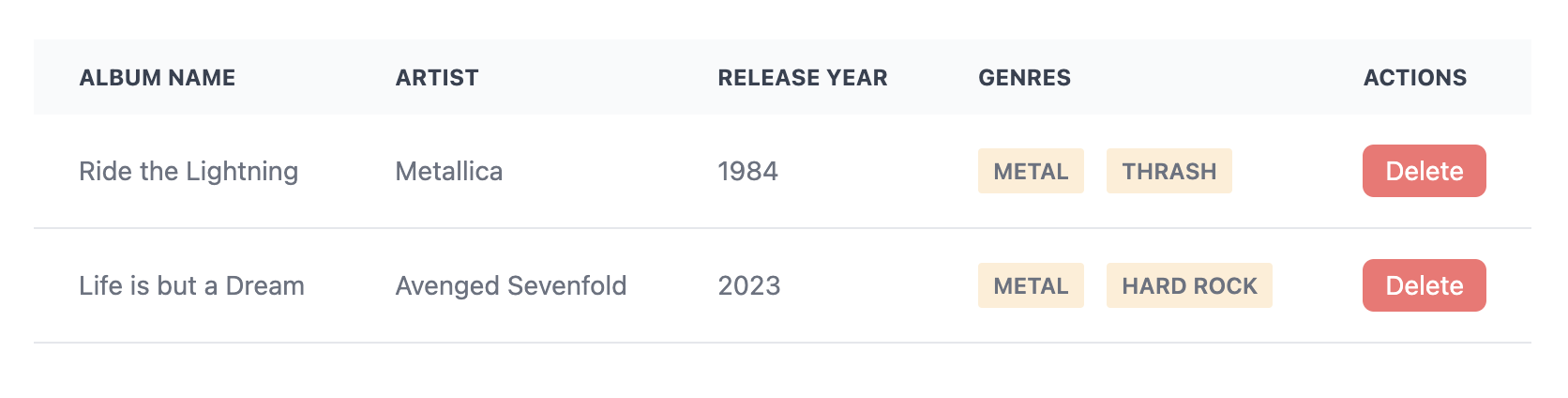
];This change results in the following update to the table.
Next, we’ll enable filtering on the genres column. Since the column is an array of strings, the default filtering that checks for equality between the column value and the filter value won’t work. Fortunately, TanStack Table allows you to select from a predefined set of common filter functions. If none of those meet your requirements, you can define your own filter function. Since our use case is pretty simple, we can use the existing arrIncludes function, which checks to see if the column array includes the filter value. To make this change, just set the filterFn property on the genres column definition to "arrIncludes".
Now we need to setup the column filter state for the table. For this, we just need to add a column filter state value and set some additional properties in the configuration object we pass to useReactTable.
const [columnFilters, setColumnFilters] = useState<ColumnFiltersState>([]);

const table = useReactTable<TAlbum>({
  columns,
  data,
  state: { columnFilters },
  onColumnFiltersChange: setColumnFilters,
  getFilteredRowModel: getFilteredRowModel<TAlbum>(),
  getCoreRowModel: getCoreRowModel<TAlbum>(),
});
The new properties we added to the configuration include state, onColumnFiltersChange, and getFilteredRowModel. The value for getFilteredRowModel is provided by TanStack Query; you just need to include it in the import.
Finally, we’ll add a basic select input that enumerates some hard-coded genres and applies the filter to the table. If this were a real application, we’d be smarter about this and only display genres that exist in the dataset, but for demonstration purposes this will suffice.
<form>
  <label>Genre</label>
  <select
    id="genres"
    onChange={(e) => table.getColumn("genres")?.setFilterValue(e.target.value)}
  >
    <option selected>Choose a genre</option>
    <option value="Hard Rock">Hard Rock</option>
    <option value="Hip Hop">Hip Hop</option>
    <option value="Metal">Metal</option>
    <option value="Thrash">Thrash</option>
  </select>
</form>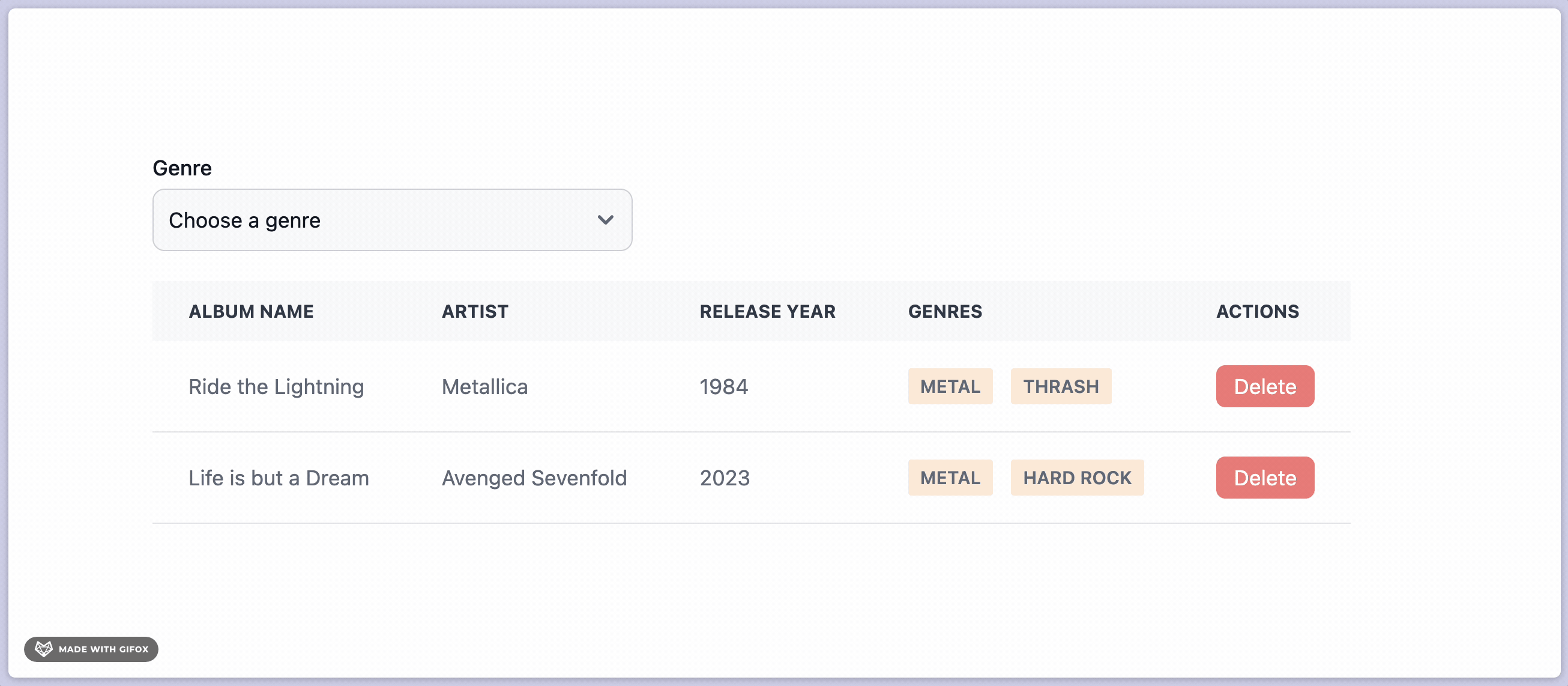
And there we go! We’ve successfully setup filtering on a column with a non-trivial data type that uses a custom render function.